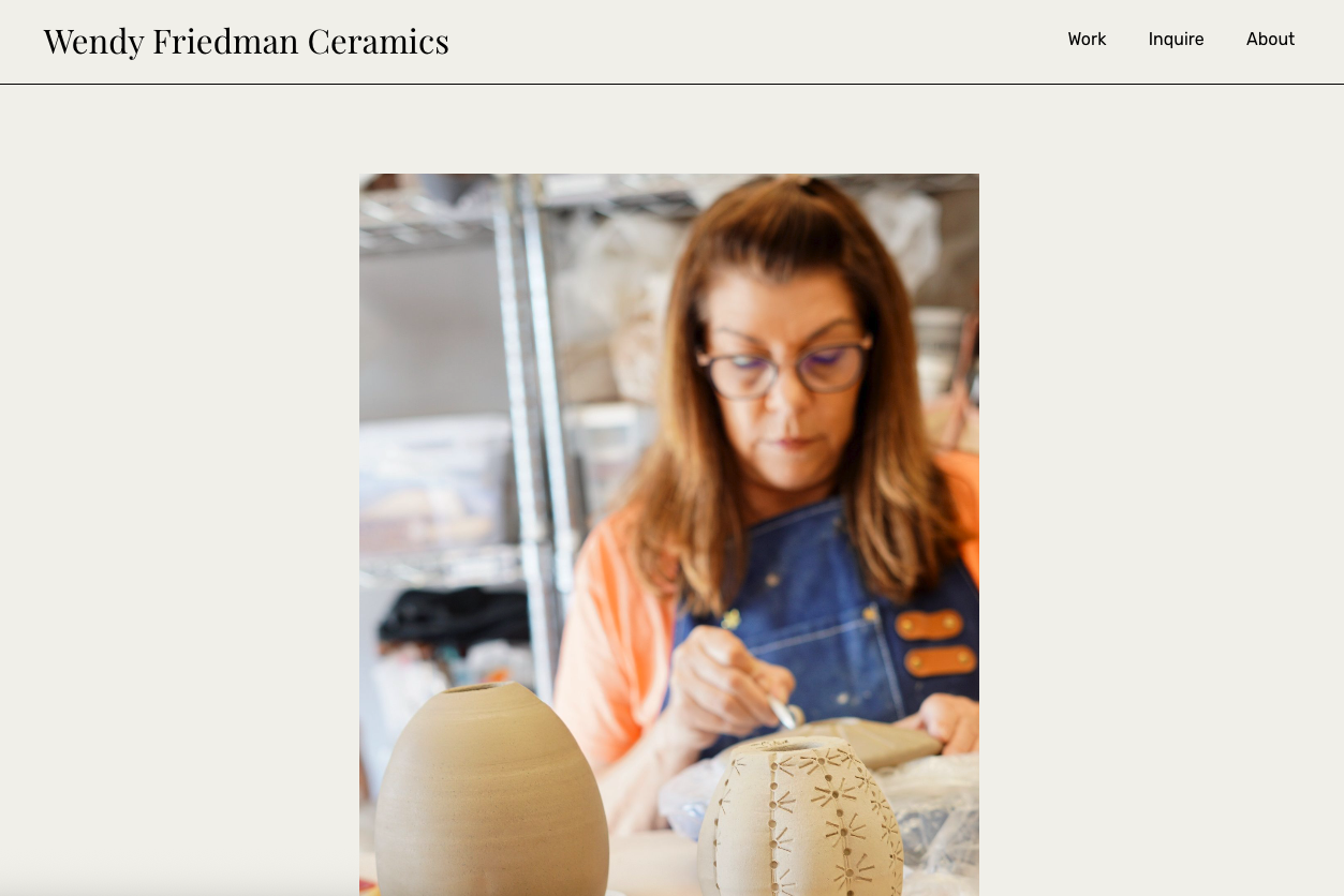
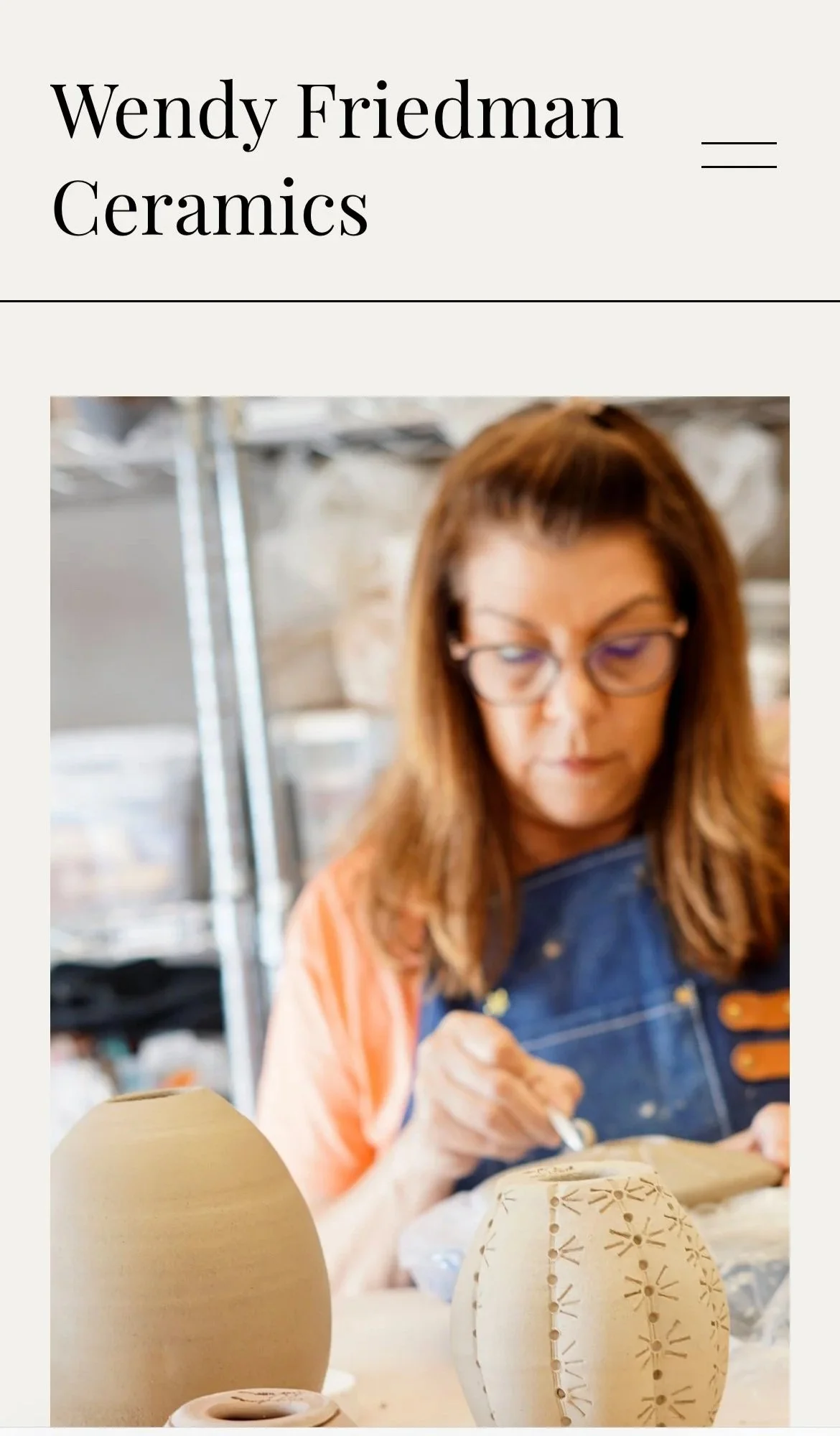
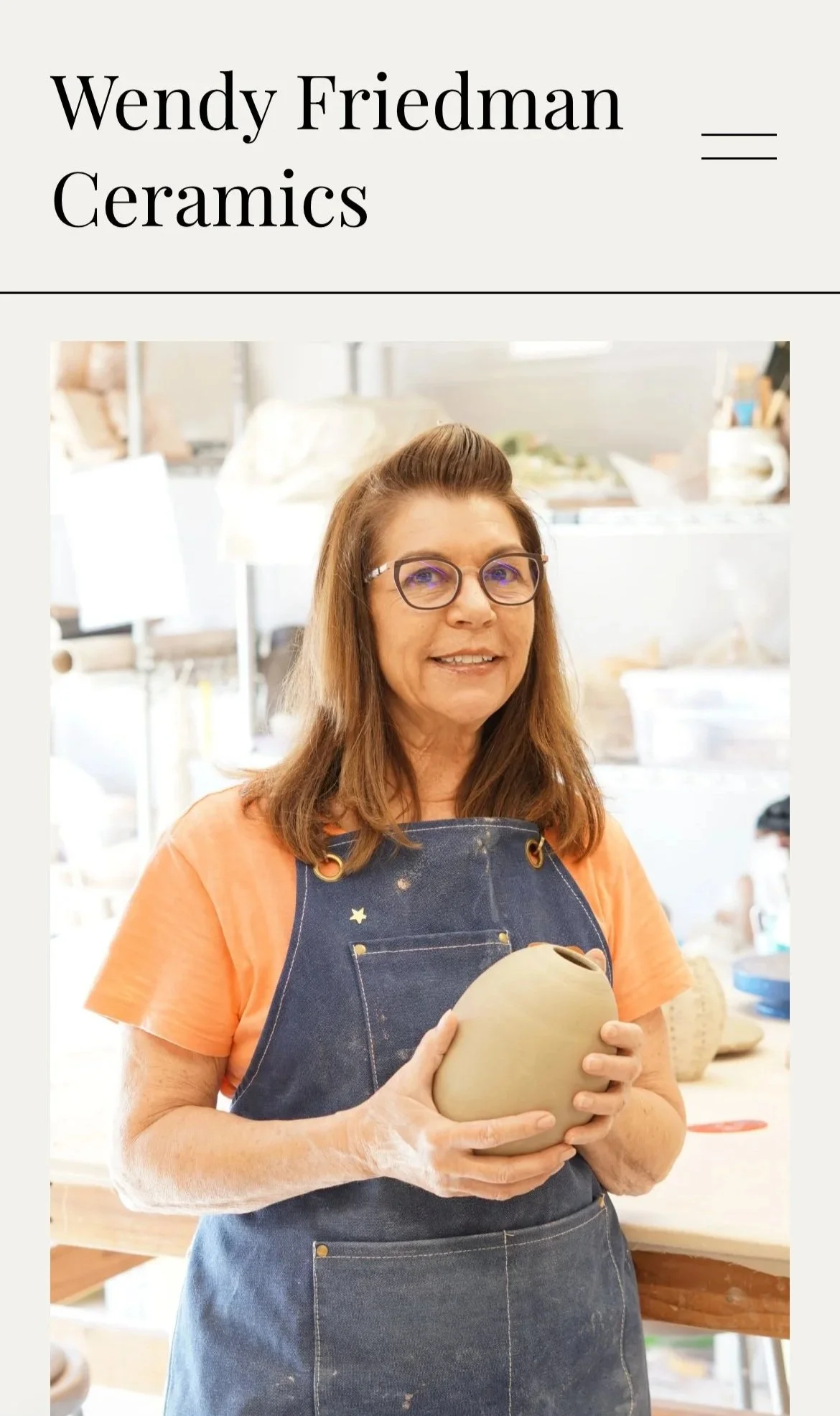
Wendy Friedman Ceramics
Wendy’s work is rooted in restraint soft forms, quiet glazes, and a deep respect for process. Our collaboration was about building a brand and website that matched that rhythm. From logo to layout to photography, every element was designed to echo her practice: thoughtful, tactile, and grounded in the handmade.
Wendy Friedman Ceramics
Client: Wendy Friedman
Project: Full Brand, Photography & Website Build
Platform: Squarespace
Website: wendyfriedmanceramics.com
The Challenge
Wendy needed a quiet, intentional online space that reflected the spirit of her hand-thrown ceramics. She wasn’t looking for a flashy store she wanted a digital extension of her studio: simple, personal, and beautiful. The challenge was to create a full visual identity, design and build the site from scratch, and capture her work through thoughtful photography all while keeping the customer journey clear and warm.
What We Did
Brand Identity & Logo Design
Designed a clean, grounded logo to reflect the warmth and restraint of Wendy’s work
Built a brand system around neutral colors, generous whitespace, and soft typography
Integrated brand tone into every piece of language and layout
Site Design & Structure
Built a minimal Squarespace site from the ground up
Structured with 3 core sections: Work, Inquire, and About
Designed mobile-first layouts with a gallery-like browsing experience
Simplified the navigation to encourage calm, intuitive exploration
Custom Inquiry-Based Shop Flow
Built a warm, user-friendly contact form instead of a traditional shopping cart
Encouraged bespoke orders and personal conversations, not just transactions
Wrote all copy in Wendy’s voice to reflect her hands-on, reflective approach

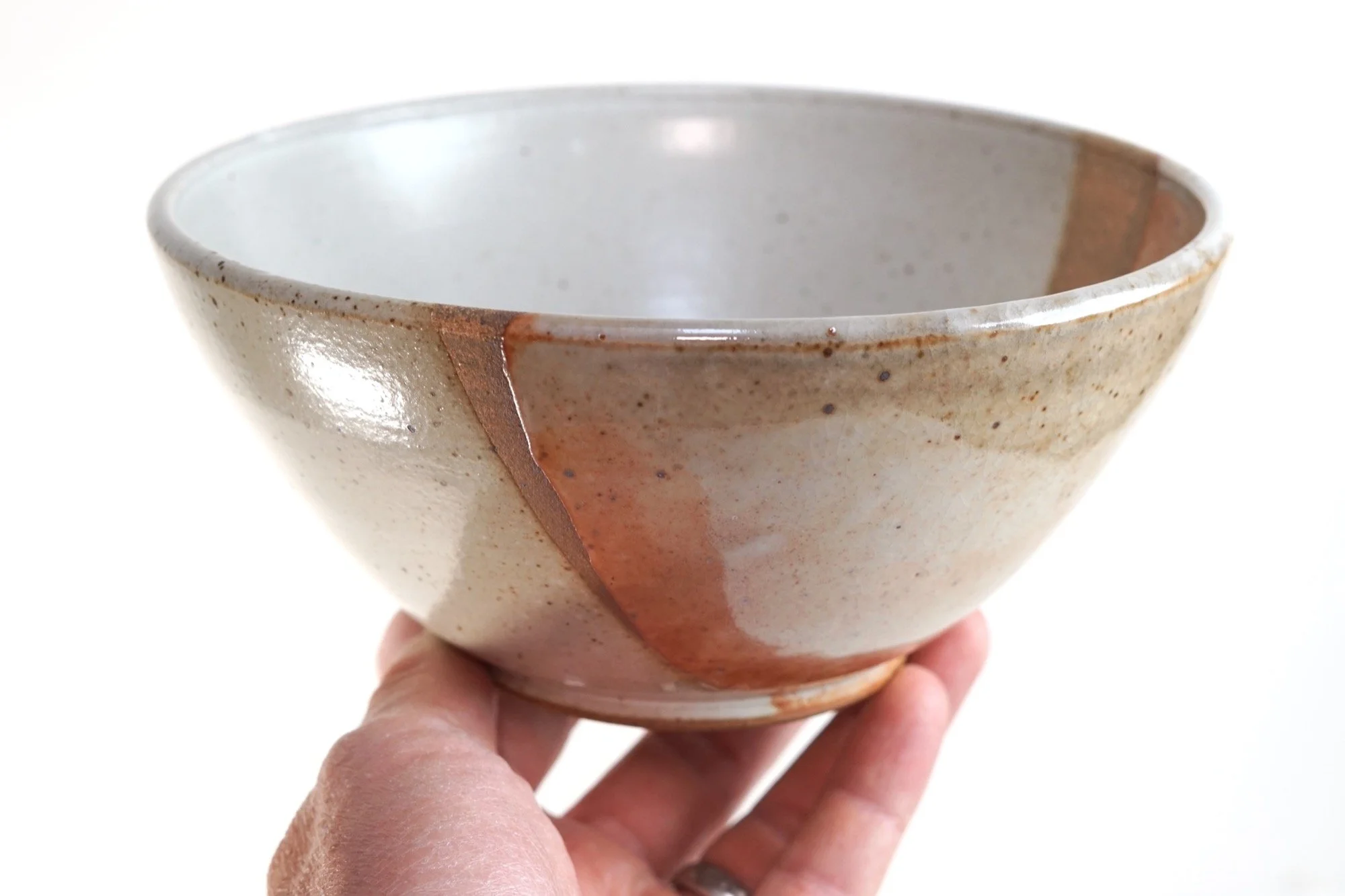
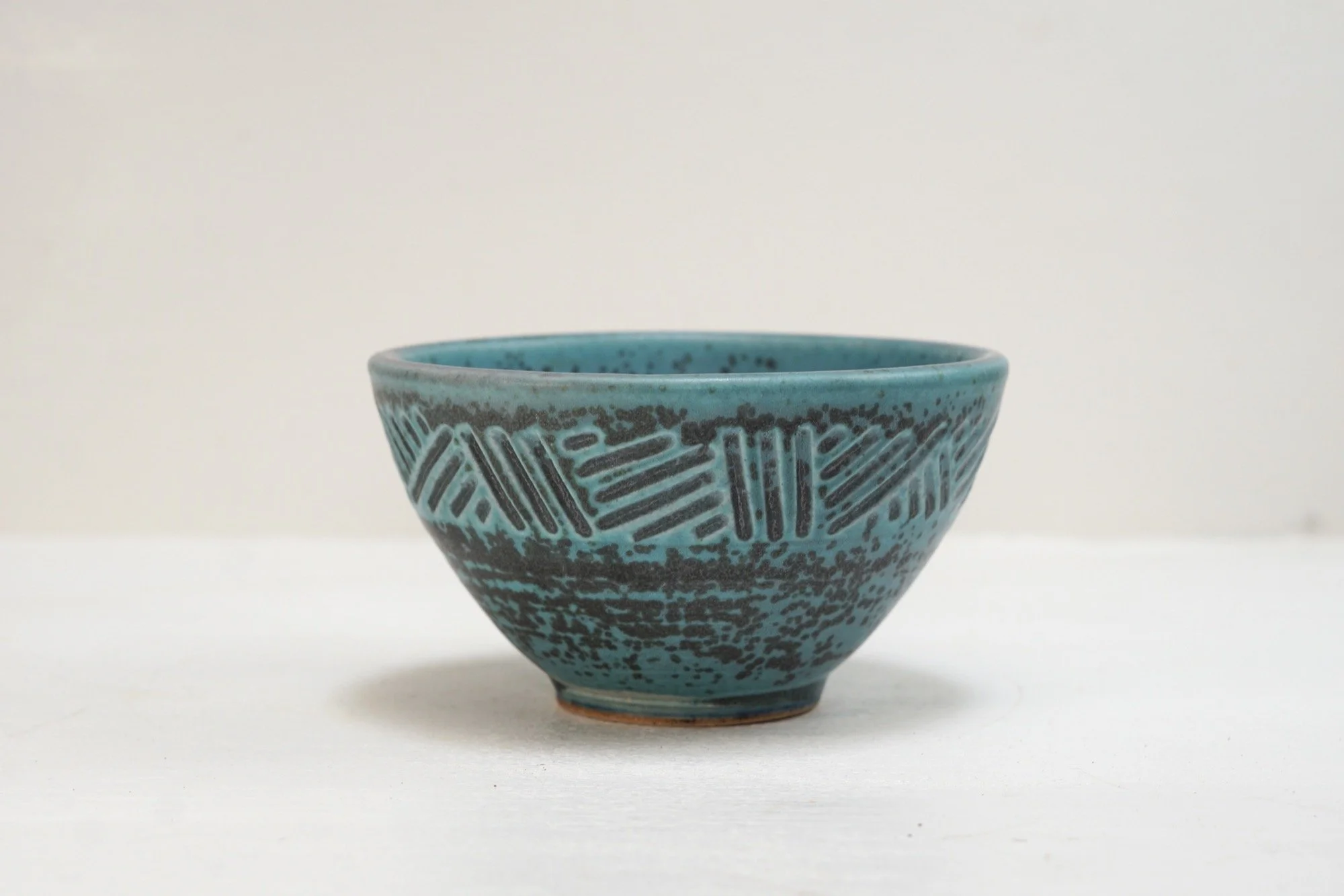
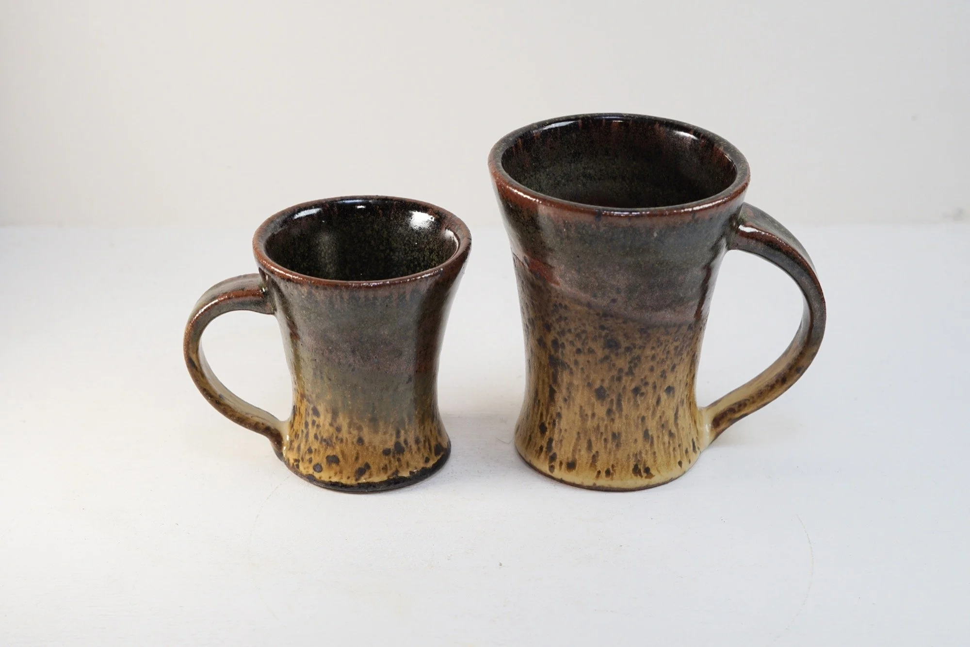
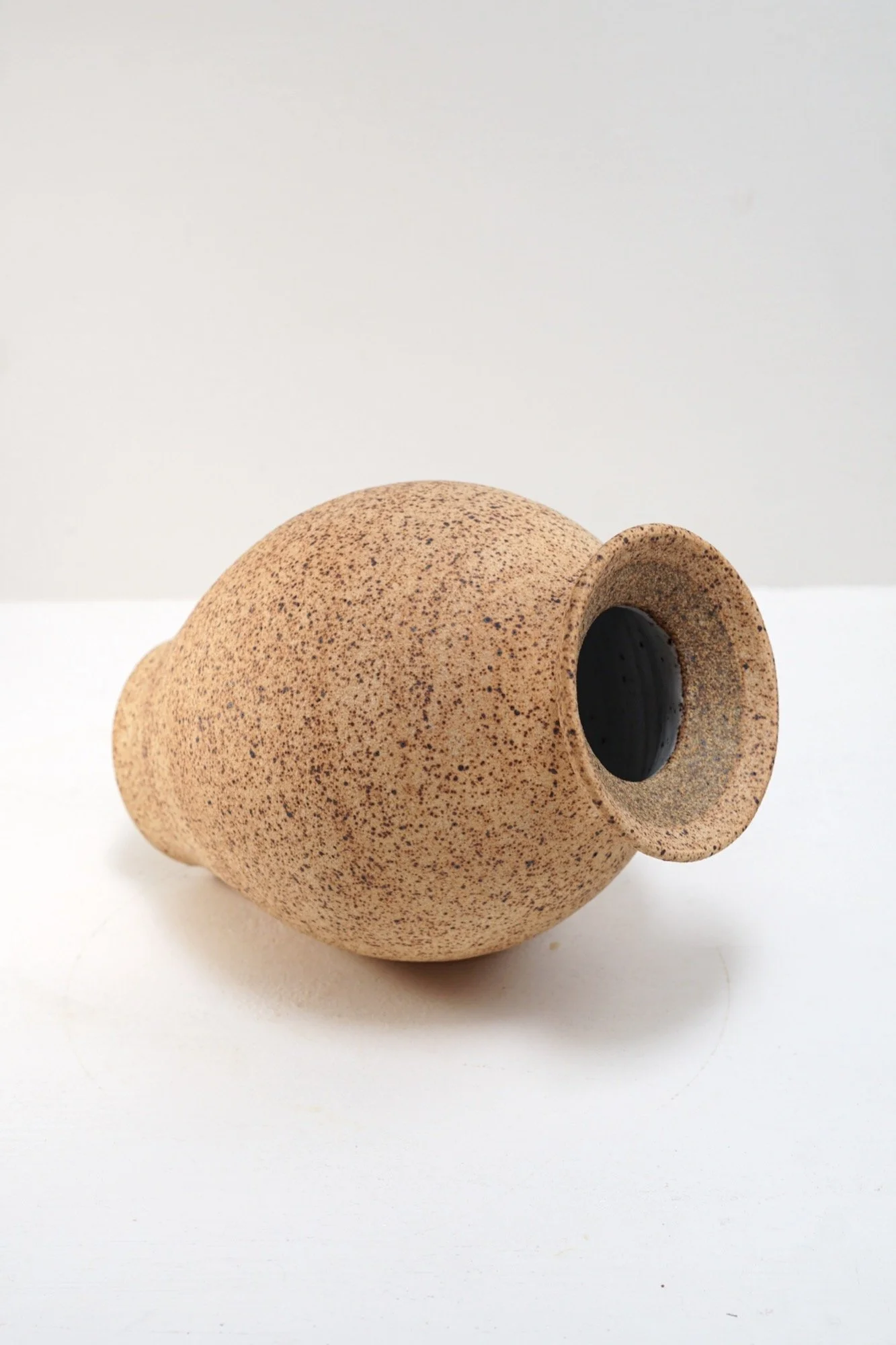
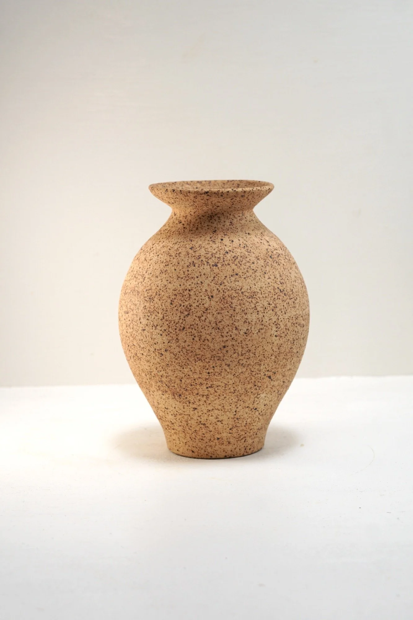
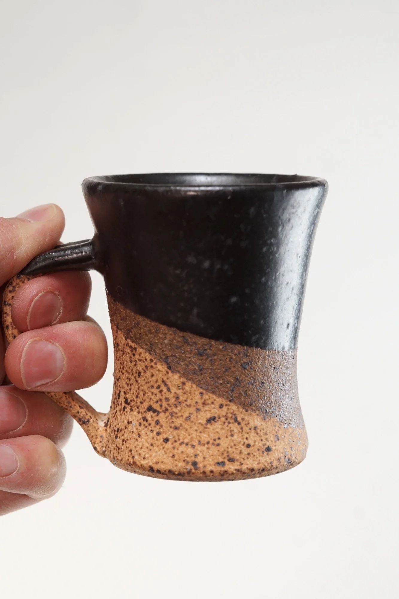
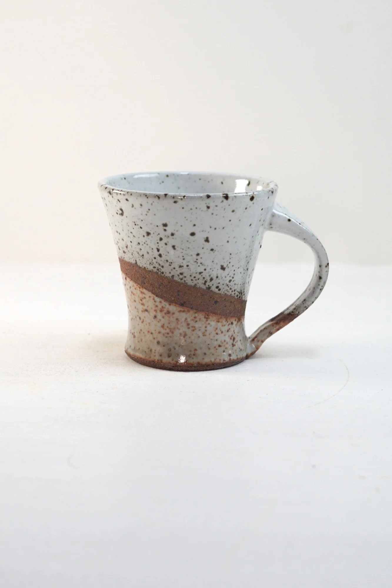
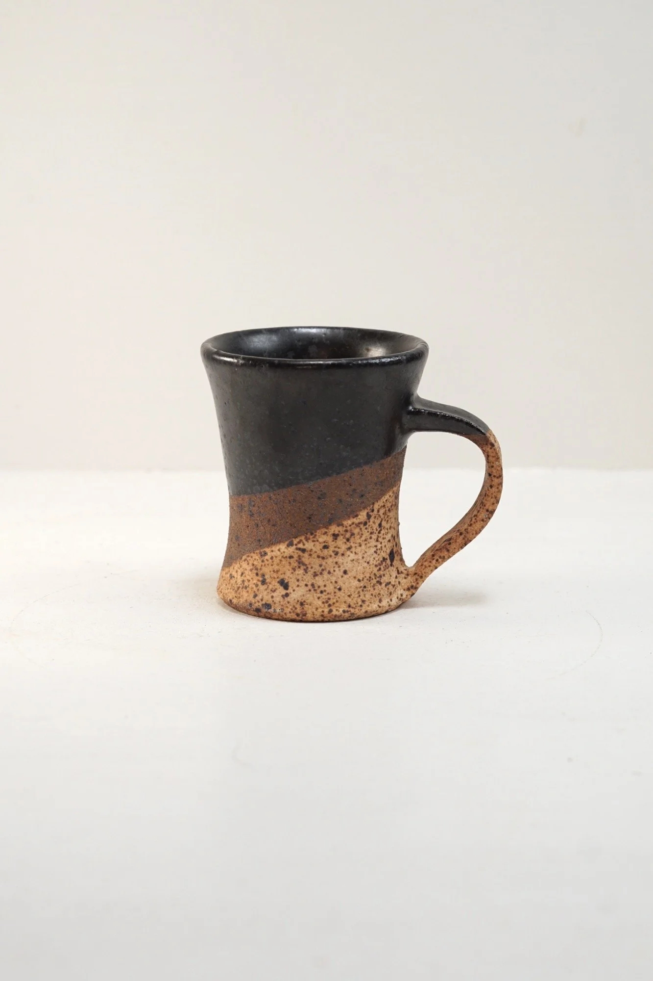
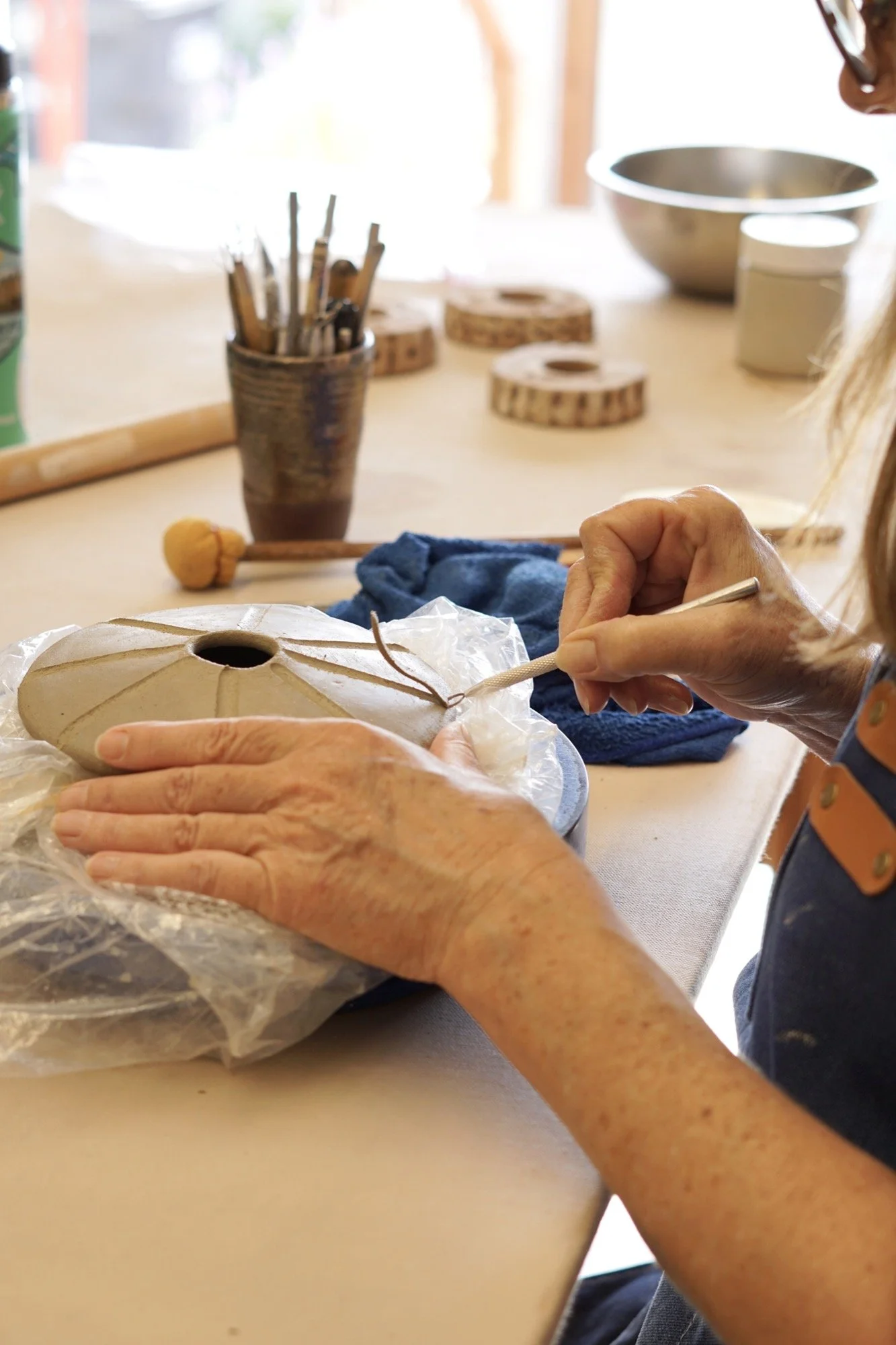
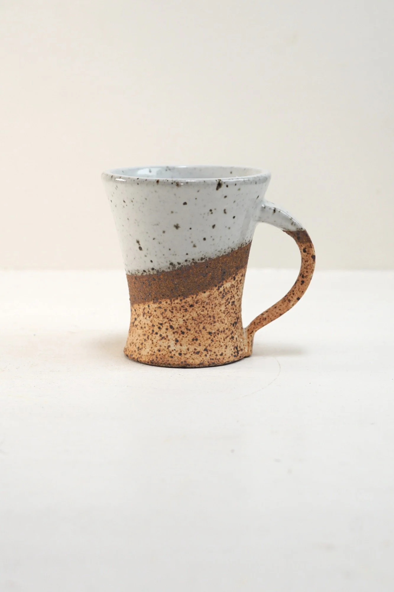
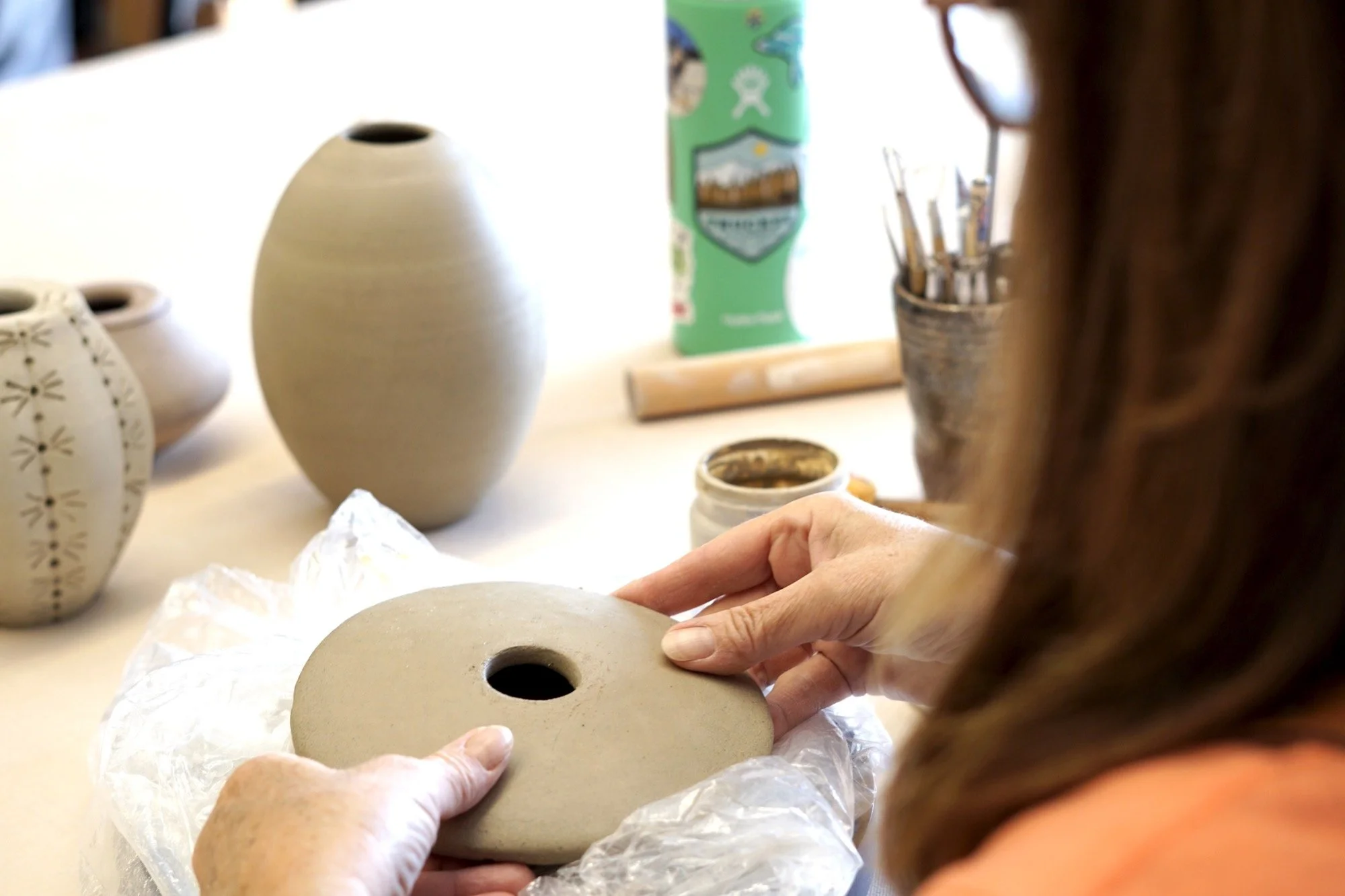
Product Photography
Shot, edited, and art directed all product photography
Captured natural textures and subtle glazes with soft, consistent lighting
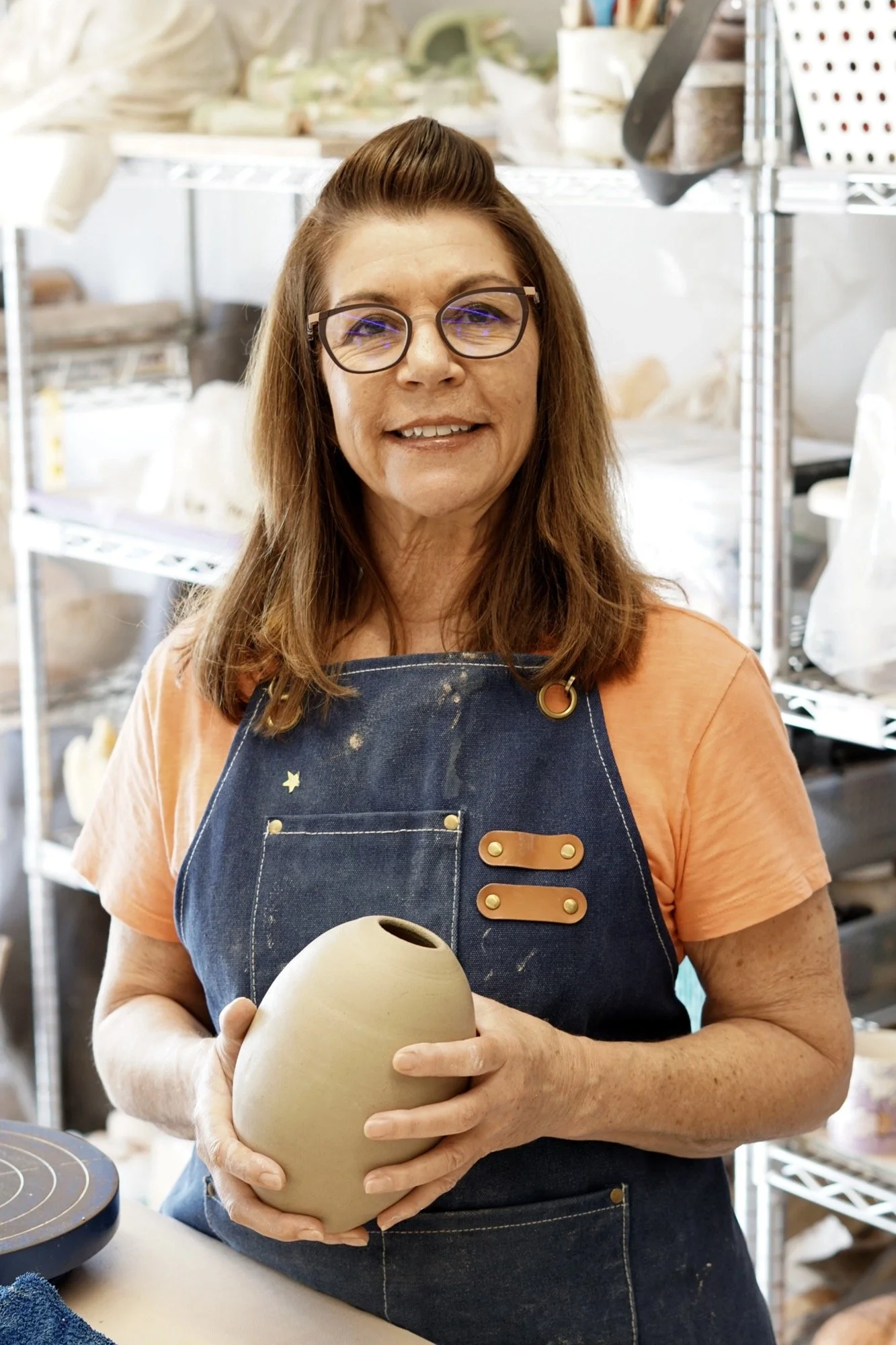
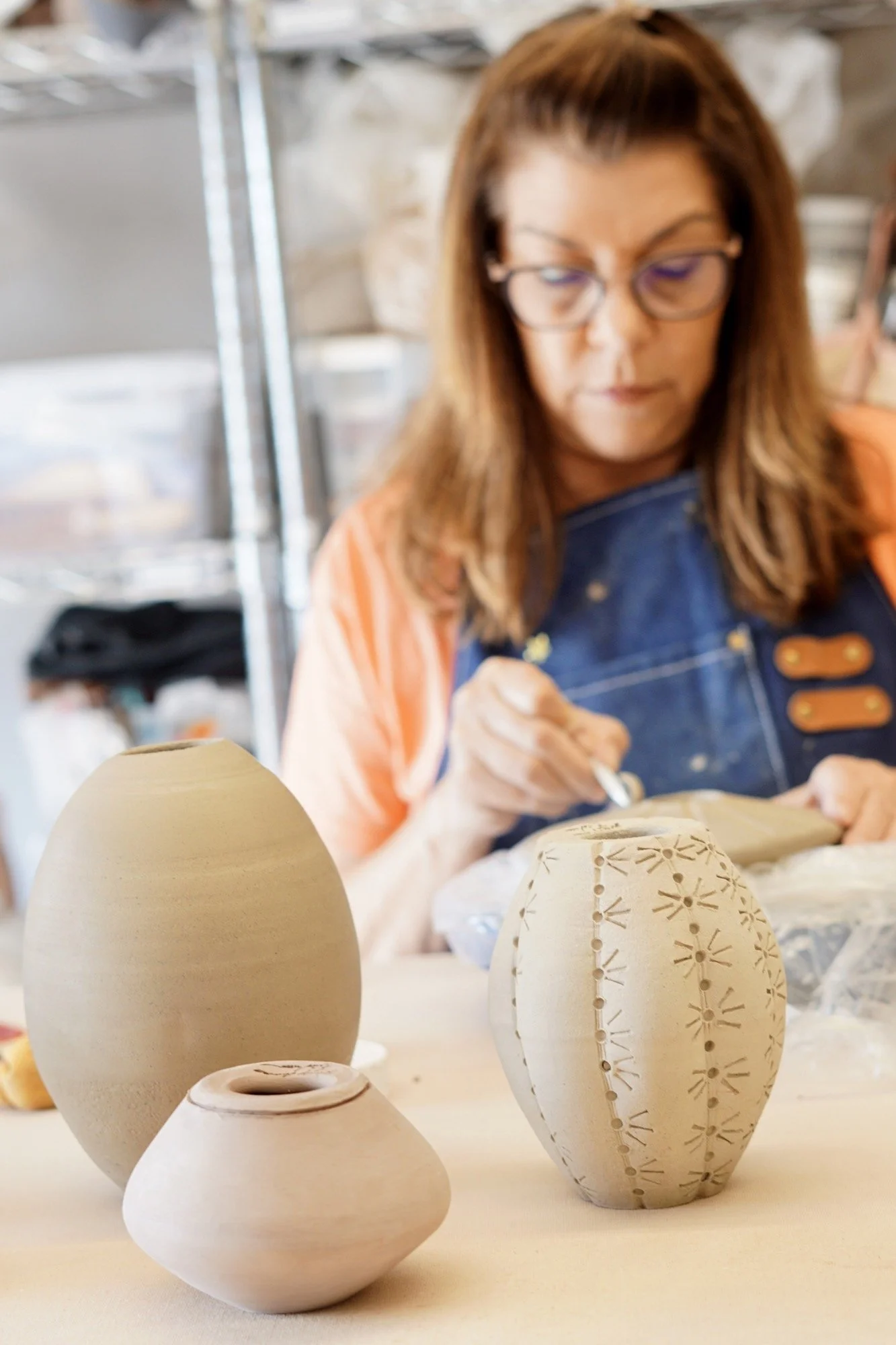
Blended studio-style object shots with behind-the-scenes portraits for a personal touch
Brand Reflections
Wendy’s work is quiet and considered grounded in the handmade and meant for daily use. Her site mirrors that intention. Every design choice, from the muted palette to the poetic copy, is about slowing things down and inviting the viewer into her world. The photography emphasizes texture and touch. The structure says: come in, stay a while.
This wasn’t just a brand or a website it was a portrait in digital form.
Outcome
A full brand identity system and logo Wendy can use across all channels
A serene, beautiful website that supports inquiries and custom orders
A clean photo library that elevates the ceramics and reflects her practice
A digital home that feels personal and true to the artist
Why This Project Worked
Artist-first thinking: Every decision supported Wendy’s voice and pace
Visual consistency: Branding, photography, and design speak the same language
Built for connection: The site encourages conversation, not just commerce